Introduction to Data Frames
Outcomes
- Select subsets of rows of data frames
- Manipulate data frames, for example, defining columns and permuting rows
- Create line plots and comparative boxplots 3.142.
Background
Several lightning fires began after August 15th, 2020 in California. How did this affect air quality?
One way to measure air quality after a fire is by particulate matter in the air. According to the Environmental Protection Agency (EPA) “PM stands for particulate matter (also called particle pollution): the term for a mixture of solid particles and liquid droplets found in the air. Some particles, such as dust, dirt, soot, or smoke, are large or dark enough to be seen with the naked eye. … PM2.5 : fine inhalable particles, with diameters that are generally 2.5 micrometers and smaller.” In this assignment, we’ll analyze data provided by the EPA daily outdoor air quality.
Instructions
- Answer the following questions, and show all your R code.
- Upload your submission to Canvas in nicely formatted HTML generated from Rstudio.
- Hint: The following functions will help you.
as.Date, plot, boxplot, order
Questions
Load the data.
air = read.csv("http://webpages.csus.edu/fitzgerald/files/stat128/fall20/ad_viz_plotval_data.csv")
table(air$Site.Name)
##
## Auburn-Atwood Bliss SP
## 129 2
## Colfax-City Hall Davis-UCD Campus
## 147 255
## Lake Tahoe Community College Lincoln-2885 Moore Road
## 11 149
## Roseville-N Sunrise Ave Sacramento-1309 T Street
## 276 306
## Sacramento-Bercut Drive Sacramento-Del Paso Manor
## 38 215
## Sloughhouse Tahoe City-Fairway Drive
## 255 152
## Woodland-Gibson Road
## 121
Pick a site from the column
Site.Namein the data that you find personally interesting, and select the rows in the data frame that correspond to that site. Use this subset for the remainder of the analysis. Mention why this site interests you.
site = air$Site.Name == "Roseville-N Sunrise Ave"
air1 = air[site, ]
I choose Roseville-N Sunrise Ave as my site personally because I have a friend who moved there years ago and lost touch. Literally, I’m curiouse how she’s doing in general, but Mean PM2.5 is as important in our current CA living condition. ## 2
Plot a line plot of the columns
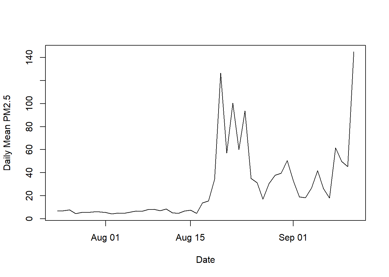
Daily.Mean.PM2.5.Concentrationas a function ofDate. Start one month before the fire and go to the end of the data set. Comment on what the graph shows.
d1 = as.Date(air1[, "Date"], format = "%m/%d/%Y")
air1[,"afterfire"] = as.Date("2020-07-25") <= d1 & as.Date("2020-09-25") >= d1
air2 = air1[air1$afterfire == TRUE,]
pm2 = air2[, "Daily.Mean.PM2.5.Concentration"]
d2 = as.Date(air2[, "Date"], format = "%m/%d/%Y")
plot(d2, pm2, type = "l", xlab="Date", ylab="Daily Mean PM2.5")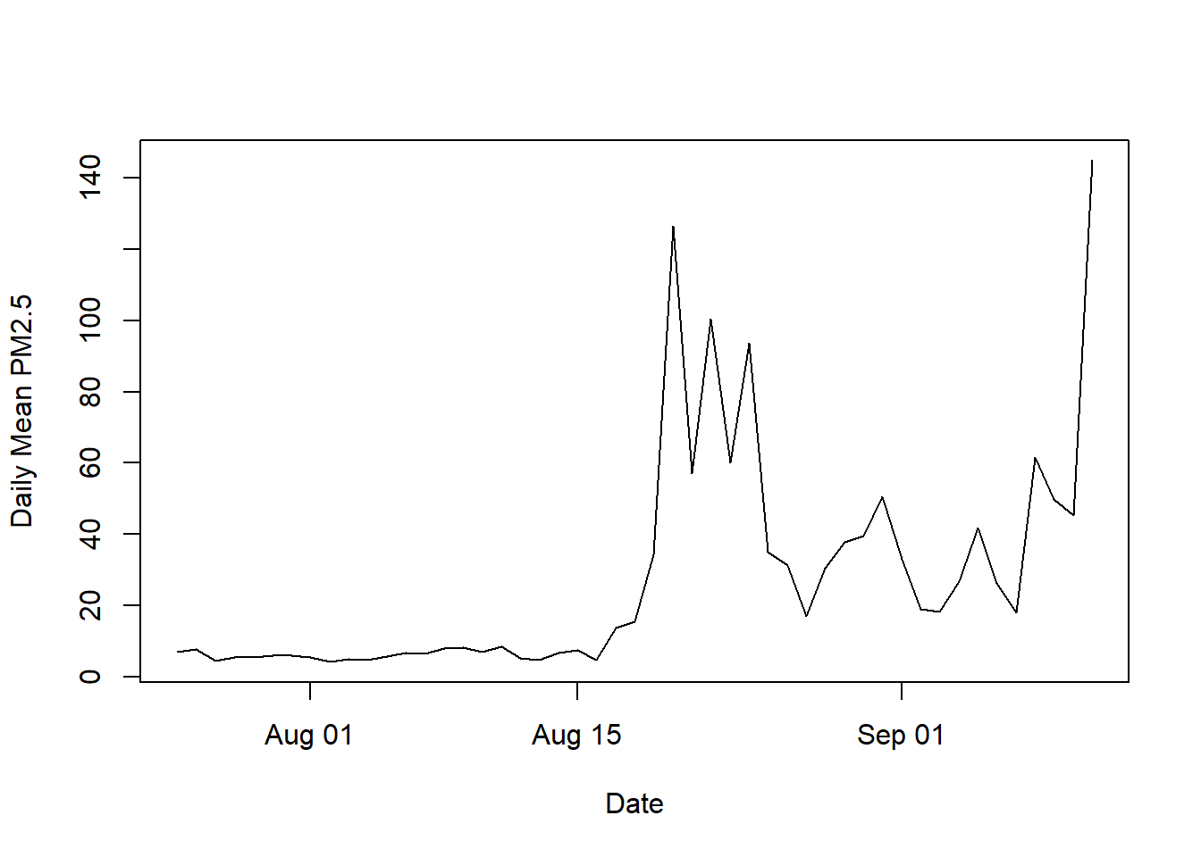 > I first choose August 25 to be fire starting date so the selected data is from 7/25/20 to 9/25/20. The graph shows PM2.5 concentration is steady before mid August. Starting mid August, PM2.5 is high from 8/18 to 8/24 and lower from 8/25 to 9/7. Eventually, Pm2.5 is peak again from 9/8.
3
Create a comparative boxplot of “Daily.Mean.PM2.5.Concentration” in the month before the fire and the month after the fire. Comment on what the boxplots show. Hint: create a new column that indicates if the observation happened before or after the fire.
air3 = air[site, ]
air3[,"afterbefore"] = (as.Date("2020-08-25") <= d1 & as.Date("2020-09-25") >= d1) | (as.Date("2020-08-25") >= d1 & as.Date("2020-07-25") <= d1)
air4 = air3[air3$afterbefore == TRUE,]
pm2.1 = air4[, "Daily.Mean.PM2.5.Concentration"]
d3 = as.Date(air4[ ,"Date"], format = "%m/%d/%Y")
plot(d3, pm2.1, type = "l", xlab="Date", ylab="Daily Mean PM2.5")
boxplot(Daily.Mean.PM2.5.Concentration ~ afterbefore,air4, xlab="Date", ylab="Daily Mean PM2.5")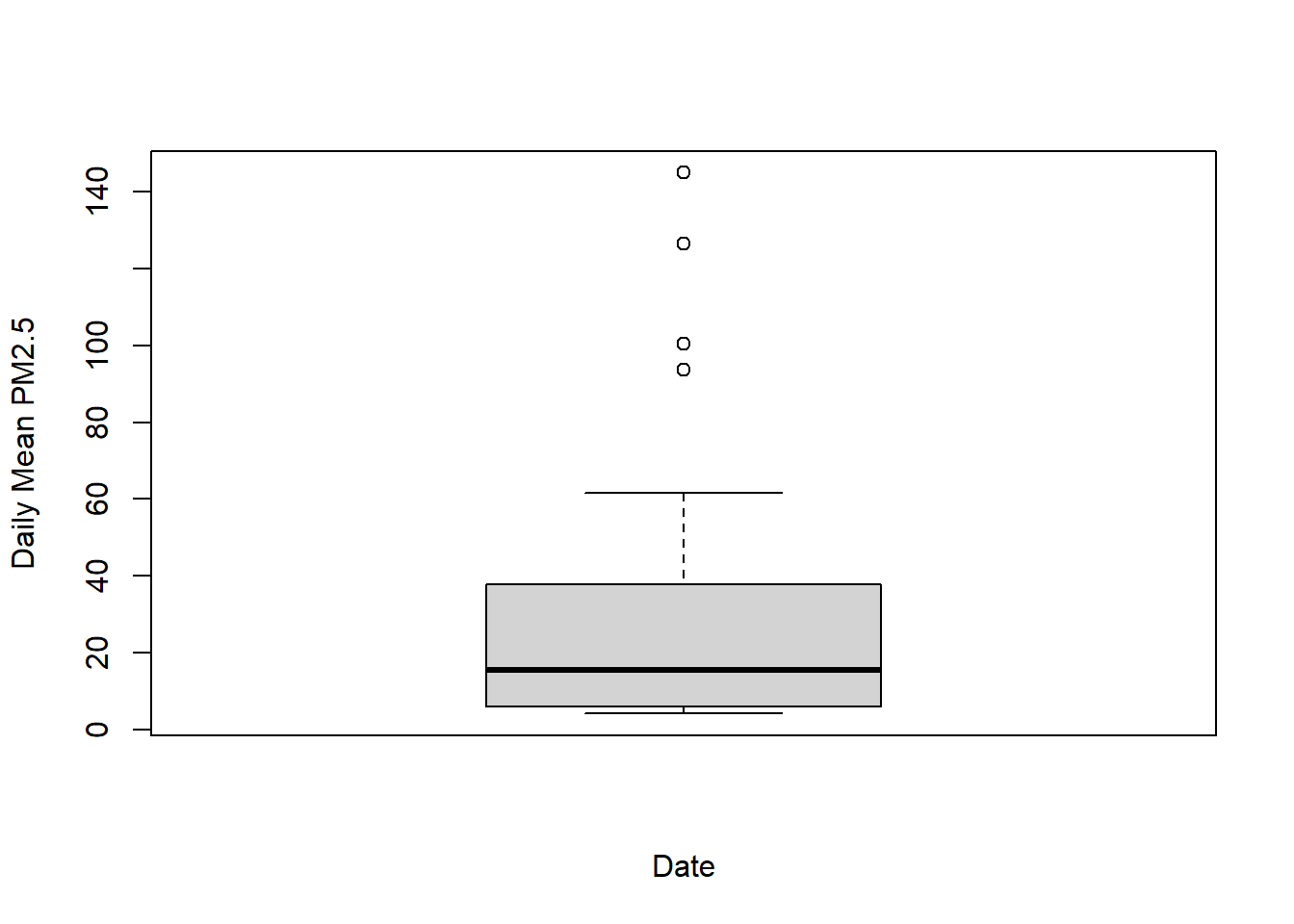
The selected data is from 7/25 to 9/25. According to the graph, PM2.5 concentration is low before 8/18 and rises up after that. Based on the boxplot, mean pm2.5 is below 20 in the 2-months period. Overall, PM2.5 is around 10 to 65 with a few outliers above 90.
4
- Function ( d: data frame for a site, n = number of observations)
- to plot the n most recent PM2.5 particle measurements on the y axis, with date as the x axis.
#' Plot the n most recent PM2.5 particle measurements on the y axis, with date as the x axis.
#'
#' @param d data frame containing columns Daily.Mean.PM2.5.Concentration and Date for a single site
#' @param n number of observations to include
plot_pm2.5 = function(d, n)
{
dn = tail(d,n)
pm2n = dn[, "Daily.Mean.PM2.5.Concentration"]
date = as.Date(dn[, "Date"],format = "%m/%d/%Y")
plot(date, pm2n, type = "l", xlab= "Date", ylab= "Daily Mean PM2.5")
}
Verify that
plot_pm2.5works forn = 100andn = 50.
First plot shows 100 observations that is from late May until 9/11 of air1 which is Roseville-N Sunrise Ave site. Second plot shows 50 observations that is from late July until 9/11 of air1 which is Roseville-N Sunrise Ave site.
plot_pm2.5(air1,n = 100)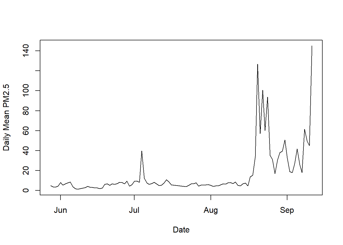
plot_pm2.5(air1,n = 50)